Color Analysis - Dressika
- 4.3
- Rating
- 5.00M
- Installs
- Free
- Price

 Analysis by App-foxy
I approached Color Analysis - Dressika as someone who wanted practical help choosing flattering colors, not as a replacement for a professional stylist. It is a free beauty app from Seasonal Color Analysis AI that uses color analysis as its main idea, then connects that result with hair color, makeup, and wardrobe decisions. The appeal is simple: instead of guessing whether a shade suits me, I can use the app to create a more organized starting point.
My first impression was that it is most useful when I treat it as a guide rather than a final verdict. A suggested palette can make shopping and getting dressed easier, but lighting, camera quality, makeup, hair dye, and personal taste all affect the result. That balance matters here. The app can give a beginner a clear direction quickly, while someone expecting a perfectly objective style diagnosis may find the experience less definitive.
Getting from installation to a useful color decision
I start by treating the first analysis as a baseline, then check whether its palette helps explain colors I already wear rather than immediately changing my look. A fresh photo in even daylight makes that comparison more worthwhile, and one small wardrobe or makeup test can reveal whether the guidance feels practical. From there, the next section looks at how the app turns a result into everyday choices.
You May Also Like

 Blood Strike: 2.5 Anniversary
Blood Strike’s Loadouts Turn Every Drop Into a Tactical Gamble
A close look at Blood Strike’s custom loadouts: how fast access to signature weapons reshapes its battle royale rhythm, rewards preparation, and narrows the gap between fights.

 Pandora - Music & Podcasts
Pandora’s Music Is Easy to Start, but Harder to Recover
Pandora’s strength is its low-effort path from a seed to a station. Its weak spot is how much confidence it asks you to place in connection, setup, and quiet recovery.

 8 Ball Pool
 Is Built on Rivalries, Rematches, and Routine
A close look at the rivalries, rematches, shared routines, and unanswered safety questions that turn a quick pool match into a persistent mobile community.

 Samsung Music
’s Quiet Strength Is Playing What You Already Own
Its reach comes less from spectacle than from dependable access to a personal library. That simplicity is both the app’s strongest retention engine and its ceiling.

 AccuWeather: Weather Radar
AccuWeather Review: A Quick, Clear Forecast for Everyday Decisions
For everyday plans, the best forecast is the one you can understand quickly. AccuWeather makes rain timing, radar, and local conditions easy to act on, with a few trade-offs.

 Hill Climb Racing
Why Hill Climb Racing Still Turns Crashes Into One More Run
A tiny car, a bumpy hill and one more upgrade: Hill Climb Racing keeps resurfacing because its simple chaos makes every near-miss feel personal.
More From Our News Desk
View All News


What the app is really designed to do
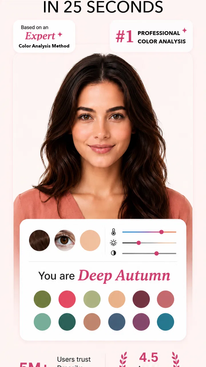
The central experience revolves around identifying a personal seasonal color palette. In everyday terms, the app tries to help me understand which groups of colors may work well with my appearance. It then extends that idea into choices involving clothing, makeup, and hair color. That makes it more practical than an app that only labels a season and stops there.
I found the wardrobe angle especially approachable because it turns an abstract result into something I can use while getting dressed. A palette is easier to understand when I can connect it to a shirt, lipstick, scarf, or hair inspiration. The hair color changer also makes the concept more visual: rather than imagining a different shade from a written recommendation, I can explore how a change might look before making a real commitment.
The app belongs firmly in the beauty category, but it is not a photo editor in the broad, entertainment-focused sense. Its purpose is narrower and more useful for people who are trying to make consistent style decisions. If I only want dramatic filters or casual image effects, this is not the right tool. If I want a repeatable reference for colors, it has a clearer job.
What to prepare before the first analysis
The quality of a color analysis depends heavily on the image I use. I recommend taking a fresh photo in soft, even daylight, with the face clearly visible and without strong colored light nearby. A bright window can be helpful, but direct sunlight may create harsh shadows and change the apparent tone of skin, hair, and eyes.
I would also avoid judging the app from a photo taken under warm indoor bulbs. Yellow lighting can make skin appear warmer than it is, while a cool light can push the result in the opposite direction. This is one of the most important practical details for a first-time user because a poor image can make the palette feel wrong even when the app is functioning normally.
For the cleanest comparison, I would use a neutral top and keep the face unobstructed. Heavy makeup, tinted glasses, and strong filters can all influence what the image communicates. If the first result feels surprising, I would repeat the process with a better photo before deciding that the recommendation is useless.
The first setup is more important than it looks
After installing the app, I would begin with the analysis rather than immediately exploring every style option. The most efficient path is to establish a baseline palette first, then use the hair, makeup, and wardrobe areas to see how that recommendation translates into real choices. This prevents the experience from becoming a collection of disconnected visual experiments.
The app is free to download and is suitable for Everyone, which makes it easy to try without treating the first session as a major purchase. It includes in-app purchases ranging from under a dollar to several dozen dollars per item, so I would pay attention to what is available before assuming every part of the experience is included at no cost. The sensible approach is to learn what the free experience tells me, then decide whether extra options are genuinely useful.
It runs on Android devices using version 7.0 or later. The current release is version 2.3.9, and the app has been available since August 2020. Those details suggest it is an established tool rather than a brand-new experiment, but they do not remove the need to check how comfortably it performs on a particular phone.
How I would reach the first meaningful success
For me, the first successful action would not be obtaining a season name. It would be using the suggested palette to make one real decision. For example, before buying a blouse, I could compare its color with the recommended shades and ask whether it belongs to the same visual family. That turns the analysis into something measurable and prevents me from treating the result as a label with no practical effect.
A useful beginner workflow is to choose three items already in the wardrobe: one color I regularly wear, one color I avoid, and one color I am unsure about. I would compare those choices with the palette and notice patterns rather than focusing on a single shade. This is a better test of usefulness because personal color is usually about relationships between colors, not a rigid list of acceptable and forbidden clothing.
The same method works with makeup. Instead of replacing everything at once, I would start with one product category and compare a familiar shade with a palette-inspired alternative. That makes the result easier to judge and avoids wasting products based on one quick impression. The app can suggest a direction, but my own comfort and the way the color looks in normal lighting still matter more than a screen preview.
Using the hair color changer without making a rushed decision
The hair color feature is potentially one of the most engaging parts because hair changes are expensive, visible, and difficult to reverse. I would use it as a comparison tool, not as proof that a particular dye will look identical in person. Digital previews can help me narrow down ideas, but they cannot fully reproduce texture, existing color, salon technique, or how a shade behaves under different lights.
A practical approach is to compare several nearby shades instead of jumping from a current color to an extreme transformation. I would look for whether the overall effect feels harmonious with the suggested palette, then take that idea to a stylist or use it as a reference when choosing a product. The app is strongest at helping me articulate what I want; it is weaker as a guarantee of the final physical result.
There is also a useful trade-off here. A virtual change is fast and low-risk, but it can encourage me to focus on the color alone while ignoring maintenance, regrowth, and the condition of the hair. I would therefore use the feature during the inspiration stage, before researching the practical cost and upkeep of the change.
Common confusion about seasonal results
One likely point of confusion is assuming that a seasonal result is permanent and absolute. My appearance can look different depending on lighting, hair color, tanning, makeup, and the colors placed near my face. A result should be understood as a helpful pattern, not a permanent identity that invalidates every color outside the recommended group.
Another misunderstanding is treating the palette as a strict shopping ban. I would not throw away clothes simply because they do not appear in the suggested range. Many colors can still work when they are worn away from the face, balanced with a more flattering neutral, or used in a small accessory. The best use of the app is to prioritize colors for important pieces, especially tops, scarves, and makeup, where the effect is easier to notice.
It is also worth separating “this color suits me” from “I like wearing this color.” Those are not the same thing. A shade may fit the analysis but feel unlike me, while another shade outside the main palette may be part of my identity and still deserve a place in my wardrobe. I would use the app to expand awareness, not to hand over every style decision.
Where the app differs from ordinary alternatives
The usual alternative is a manual online quiz, a social media filter, or advice from a stylist. A quiz is convenient but often depends on subjective answers, and a filter may be entertaining without giving a useful wardrobe system. A professional consultation can be more nuanced because a person can account for context and ask follow-up questions, but it also requires more time and money.
This app sits between those options. It offers a quicker and more visual starting point than a traditional consultation, while giving more direction than a casual quiz. Its advantage is repeatability: I can revisit the palette while considering clothing, hair, or makeup instead of relying on a result I vaguely remember.
Its limitation is equally clear. A professional can notice details that a camera-based process may not interpret consistently, and a human conversation can adapt to lifestyle, workplace expectations, cultural preferences, and budget. I would choose Dressika for exploration and everyday reference, but I would prefer a qualified stylist for a major image change or a high-stakes event where precision matters.
Small habits that make the recommendations more useful
I would save the palette in a way that is easy to consult while shopping, then compare real products under natural light whenever possible. Phone screens can make colors appear brighter or more saturated than they look in a store. The app can narrow my search, but the final check should happen on the actual fabric or product.
I would also avoid testing several variables at once. If I change hair color, makeup, lighting, and clothing simultaneously, I will not know what created the improvement. A better process is to change one element, take a few notes, and compare it with a familiar option. This turns the app into a small personal experiment rather than a one-time judgment.
Another non-obvious benefit is reducing unnecessary shopping. Once I understand which neutrals and accent colors work together, I can build combinations from clothes I already own instead of buying isolated pieces that looked attractive online. The app does not create a wardrobe by itself, but it can help me notice gaps and avoid repeating purchases that do not coordinate.
Who will get the most from it
I think it is a good match for someone starting to explore personal color analysis, especially a person who feels overwhelmed by conflicting beauty advice. It is also useful for anyone preparing for a wardrobe refresh, considering a new hair shade, or trying to make makeup shopping less random. The visual approach makes the subject less intimidating than reading long descriptions of undertones and seasonal theory.
It can be particularly helpful before a practical shopping trip. If I have limited time, I can use the palette to decide which color families deserve attention first, then judge individual items in person. That is more realistic than expecting the app to select an entire outfit without any personal input.
People who should skip it are those looking for professional-level diagnosis, exact color matching, or a complete styling service. It is also not ideal for someone who dislikes experimenting with photos or who wants recommendations completely independent of camera conditions. In those cases, a consultation or a hands-on approach with fabric swatches may be more satisfying.
What the popularity tells me, and what it does not
The app has passed five million installs and holds a 4.2 average from around thirty-seven thousand ratings, with 276 written reviews. That level of use makes it easier to see why the concept appeals to a broad audience: the promise is immediate, visual, and connected to decisions people make regularly.
Popularity does not guarantee that every analysis will suit every face or phone, though. I would still judge it by the quality of my own results, the usefulness of the palette in real life, and whether the available experience justifies any optional spending. A large user base is reassuring, but personal color analysis remains subjective enough that my own testing matters.
My next step after the first session
Once I had a palette, I would not rush into a full makeover. I would choose one low-cost, reversible experiment: a top in a suggested color, a lipstick close to the recommended family, or a temporary hair-color idea. I would wear it in ordinary settings and check it in more than one kind of light. That gives the app a fair test while keeping the consequences manageable.
If the result feels useful, I would build a small reference around combinations rather than isolated colors. For instance, I might identify a dependable neutral, a brighter accent, and a softer alternative for days when I want less contrast. This is where the app becomes more valuable over time: not because it dictates a uniform look, but because it helps me create a repeatable set of choices.
I would also revisit the analysis after a major hair change or when I notice that my usual makeup is affecting the way colors appear. I would not interpret a different result as a failure. It is a reminder that the image and the surrounding conditions influence the recommendation, and that the app works best when I use it as an ongoing visual reference.
Overall, I see Color Analysis - Dressika as a friendly starting point for people who want more confidence with color without immediately paying for a personal consultation. Its strongest qualities are the connection between palette, wardrobe, makeup, and hair experimentation, plus the ability to turn a vague style question into a visual process. Its main weakness is that a camera-based suggestion can feel more certain than it really is.
I would recommend trying it with a carefully chosen photo, testing the result against clothes I already own, and keeping the first changes small. If I remember that the app offers guidance rather than a strict rulebook, it can make beauty decisions clearer and shopping more intentional. For beginners, that is a meaningful first step; for advanced users, it is best treated as a convenient second opinion rather than the final authority.
FAQs for Color Analysis - Dressika
01What is Color Analysis - Dressika used for?
Color Analysis - Dressika is designed to help users determine which colors best complement their skin tone. By analyzing your natural coloring, the app provides personalized fashion advice, ensuring you make wardrobe choices that enhance your appearance. It's an excellent tool for anyone looking to refine their style with confidence.
02How does the app determine the best colors for me?
The app uses advanced technology to analyze your skin tone, hair color, and eye color. By taking a photo or selecting from pre-defined options, Dressika evaluates your natural palette and suggests colors that suit you best. This personalized approach helps you make informed decisions about clothing and accessories.
03Is Color Analysis - Dressika user-friendly for beginners?
Yes, Color Analysis - Dressika is designed with user-friendliness in mind. The app features an intuitive interface that guides users through each step of the color analysis process. Even if you're new to color theory, the app provides easy-to-follow instructions and clear results, making it accessible to everyone.
04Does the app offer fashion advice or just color analysis?
In addition to color analysis, Dressika offers fashion advice tailored to your personal color palette. The app provides tips on clothing and accessory choices that align with your analyzed colors, helping you develop a cohesive and stylish wardrobe. It's a comprehensive tool for anyone looking to enhance their fashion sense.
05Is Color Analysis - Dressika available for both Android and iOS?
Yes, Color Analysis - Dressika is available for download on both Android and iOS platforms. This ensures that users can access the app regardless of their device preference. Simply visit the Google Play Store or Apple App Store to download and start your color analysis journey today.
Pros
- Intuitive user interface for easy navigation.
- Provides detailed color analysis results.
- Offers personalized fashion suggestions.
- Includes a wide range of color palettes.
- Works offline without needing internet.
Cons
- Limited free features without subscription.
- Occasional glitches in color recognition.
- Requires access to camera and photos.
- Some features can be confusing for beginners.
- Frequent ads in the free version.

Color Analysis - Dressika
Gallery